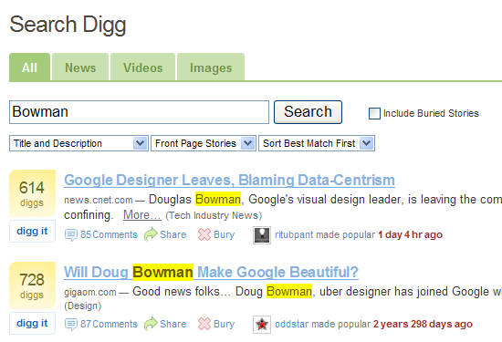
Douglas Bowman leaves Google, Two Digg postings 3 years apart aligned
Since Friday, the blogosphere including popular sites like CNET have been posting about Douglas Bowman’s exit from Google. 3 years ago, Doug Bowman joined Google to lead their visual design department. On Friday, he left and cited a myriad of reasons:
When a company is filled with engineers, it turns to engineering to solve problems. Reduce each decision to a simple logic problem. Remove all subjectivity and just look at the data…that data eventually becomes a crutch for every decision, paralyzing the company and preventing it from making any daring design decisions…
Yes, it’s true that a team at Google couldn’t decide between two blues, so they’re testing 41 shades between each blue to see which one performs better. I had a recent debate over whether a border should be 3, 4, or 5 pixels wide, and was asked to prove my case. I can’t operate in an environment like that. I’ve grown tired of debating such minuscule design decisions…
I’ll miss working with the incredibly smart and talented people I got to know there. But I won’t miss a design philosophy that lives or dies strictly by the sword of data.
Just a note, notice on Digg when doing a search for “Bowman” the top two results. They are very close to being 3 years apart, and its funny to look back on Google over the past 3 years and wonder what effect Doug (who at the time was a complete web standards superstar) had on Google.
In almost any organization where you have what I like to call “higher ups”, you can have the greatest design suggestion in the world, but unless you can prove why your decision is beneficial to the company’s bottom dollar, you will lose. I can definitely understand where Google is coming from where they care more about what data tells them to do versus someone taking design principles that may make a site aesthetically pleasing.
Here is the thing though. As Doug points out regarding Google doing user tests on 47 shades of blue, in his mind he feels its trivial, in Google’s mind they see a raising or lowering of dollar bills. Does this blue garner a higher click-thru then that blue?
As a designer, I would probably side with Doug on this because at some point it comes off as being greedy. Does Google “have” to keep making more and more money at the sacrifice of a design interface? Where is the cut off line? There is ALWAYS a method to absolutely maximize your dollar intake, but where and when do you know that is? If you make as much money as Google, there “should” be a point where the money coming in is “just fine” versus the mentality “we can make more if we do this”. That is greed at its finest.
Trust me, I like Google’s products and I do like their interfaces, but I was following Doug’s blog 5 years ago and remember seeing the original posting that he was headed off to Google. I honestly don’t know what product or webpage interfaces he has been involved with during that time. I was hoping “something” would have popped out at me in the last 3 years, but nothing has.
Here are a couple CNET articles talking about it:
Thoughts?
Tags: Design, doug bowman, douglas bowman, exit, google, quit, stopdesign
